K-Means Code and Description
** Please type code into your code window,
instead of copying and pasting
-this can help you understand the process better **
Section 1: Imports
import numpy as np
import pandas as pd
import matplotlib.pyplot as plt

from sklearn.datasets import make_blobs
from sklearn.cluster import KMeans
from sklearn.metrics import silhouette_score
We import NumPy and pandas for data handling, matplotlib for plots, and sklearn tools to create data, build K-Means, and judge cluster quality.
Section 2: Create a Reproducible Dataset
X, y_true = make_blobs(
    n_samples=300,
    centers=4,
    cluster_std=1.10,
    random_state=42
)

df = pd.DataFrame(X, columns=["feature_1", "feature_2"])
print(df.head())
print("Shape:", df.shape)
K-Means is unsupervised, so it does not need true labels to train. We still keep y_true here only to help us visually check whether the clustering result looks sensible.
Section 3: Understand the Core Idea
# K-Means repeats three main actions:
# 1) choose k cluster centers
# 2) assign each point to the nearest center
# 3) move each center to the mean of its assigned points
#
# It repeats until the centers stop changing enough
# or the maximum number of iterations is reached.
The word "means" refers to the mean position of points inside each cluster. The algorithm tries to create clusters where points are close to their own center.
Section 4: Fit a Basic K-Means Model
kmeans = KMeans(
    n_clusters=4,
    init="k-means++",
    n_init=10,
    random_state=42
)

kmeans.fit(df)
n_clusters=4 tells the model how many groups to find. k-means++ gives smarter starting points, and n_init=10 runs the algorithm multiple times to reduce the chance of a poor initial placement.
Section 5: Read Cluster Labels and Centers
cluster_labels = kmeans.labels_
cluster_centers = kmeans.cluster_centers_

print("First 10 cluster labels:", cluster_labels[:10])
print("Cluster centers:\n", cluster_centers)
print("Inertia:", round(kmeans.inertia_, 2))
Each row gets a cluster number. The centers are the current mean positions of each cluster. Inertia is the total within-cluster squared distance, so smaller values usually mean tighter clusters.
Section 6: Add Clusters Back to the Data
df["cluster"] = cluster_labels
print(df.groupby("cluster").mean())
This step turns the clustering output into something practical. You can now summarize each group and ask what type of records each cluster represents.
Section 7: Plot the Cluster Result
plt.figure(figsize=(7, 5))
plt.scatter(df["feature_1"], df["feature_2"], c=df["cluster"], cmap="viridis", s=45)
plt.scatter(
    cluster_centers[:, 0],
    cluster_centers[:, 1],
    c="red",
    s=220,
    marker="X",
    label="Cluster centers"
)
plt.xlabel("feature_1")
plt.ylabel("feature_2")
plt.title("K-Means Clustering Result")
plt.legend()
plt.show()
This is the most direct graph for understanding K-Means. Each color shows one cluster and the red X markers show where the model thinks the center of each cluster lies.
Section 8: Measure Cluster Quality with Silhouette Score
score = silhouette_score(df[["feature_1", "feature_2"]], cluster_labels)
print("Silhouette score:", round(score, 4))
Silhouette score checks whether points are close to their own cluster and far from other clusters. Higher values generally indicate cleaner separation.
Guidelines for different datasets
# 1) Replace make_blobs with your real dataset
# Example:
# df = pd.read_csv("your_file.csv")
# X = df[["col1", "col2", "col3"]]

# 2) Keep only numeric features for standard K-Means
# - Convert categories before clustering if needed

# 3) Scale features when units differ a lot
# from sklearn.preprocessing import StandardScaler
# scaler = StandardScaler()
# X_scaled = scaler.fit_transform(X)

# 4) Try multiple k values
# - Do not assume the correct number of clusters
# - Use elbow curve and silhouette score together

# 5) Interpret clusters after fitting
# - Add labels back to the original dataset
# - Compare means, medians, counts, and business meaning

# 6) Remember cluster numbers are just names
# - Cluster 0 is not "better" than cluster 1
# - The numbering can change across runs

# 7) Watch for outliers
# - Extreme values can pull the centers away
# - Review scatterplots before trusting the result

# 8) Re-run with a fixed random_state
# - This keeps your practice workflow reproducible

# 9) Use domain logic after clustering
# - K-Means groups rows by similarity
# - You still need to explain what each group means in real work
Treat this page as a K-Means template: choose features, test several values of k, check the plots, then explain what each cluster means in real business or operational terms.
Useful Data Sources for K-Means Practice
-
UCI Machine Learning Repository - Clustering datasets
Good for structured practice datasets already tagged for clustering work. -
UCI Online Retail
Strong choice for customer segmentation with RFM-style K-Means workflows. -
OpenML dataset search
Useful when you want many tabular datasets and quick filtering by size, features, and task. -
Kaggle datasets
Best when you want practical business-style data such as mall customers, sales, products, or marketing records. -
Data.gov
Good for real public-sector data where K-Means can group regions, populations, facilities, or usage patterns. -
World Bank Open Data
Helpful for clustering countries or regions using economic, demographic, health, or development indicators.
Start with UCI or Kaggle for easy practice, then move to Data.gov or World Bank when you want more realistic clustering problems with business or policy meaning.
Graphs and Analysis
Graph 1: Raw Data Before Clustering
Open PDF: K-Means Code output fileplt.figure(figsize=(7, 5))
plt.scatter(df["feature_1"], df["feature_2"], color="#5c6bc0", s=40)
plt.xlabel("feature_1")
plt.ylabel("feature_2")
plt.title("Raw Data Before K-Means")
plt.show()Always look at the raw spread first. If the groups are visibly separate, K-Means has a better chance of producing useful clusters.
Graph 2: Elbow Method for Choosing k
inertia_values = []
k_values = range(1, 9)

for k in k_values:
    model = KMeans(n_clusters=k, init="k-means++", n_init=10, random_state=42)
    model.fit(df[["feature_1", "feature_2"]])
    inertia_values.append(model.inertia_)

plt.figure(figsize=(7.5, 4.5))
plt.plot(k_values, inertia_values, marker="o")
plt.xlabel("Number of clusters (k)")
plt.ylabel("Inertia")
plt.title("Elbow Method for K-Means")
plt.grid(alpha=0.3)
plt.show()
Inertia always falls as k increases, so the main question is where the improvement starts slowing down sharply. That bend is the elbow.
Graph 3: Silhouette Score Across k Values
silhouette_scores = []
k_values = range(2, 9)

for k in k_values:
    model = KMeans(n_clusters=k, init="k-means++", n_init=10, random_state=42)
    labels = model.fit_predict(df[["feature_1", "feature_2"]])
    score = silhouette_score(df[["feature_1", "feature_2"]], labels)
    silhouette_scores.append(score)

plt.figure(figsize=(7.5, 4.5))
plt.plot(k_values, silhouette_scores, marker="o", color="#43a047")
plt.xlabel("Number of clusters (k)")
plt.ylabel("Silhouette score")
plt.title("Silhouette Score for Different k Values")
plt.grid(alpha=0.3)
plt.show()
Use this graph with the elbow plot. If both graphs suggest the same k, you have a stronger basis for choosing that cluster count.
Graph 4: Final Cluster Visualization with Centers
best_k = 4
final_model = KMeans(n_clusters=best_k, init="k-means++", n_init=10, random_state=42)
final_labels = final_model.fit_predict(df[["feature_1", "feature_2"]])
final_centers = final_model.cluster_centers_

plt.figure(figsize=(7.5, 5))
plt.scatter(df["feature_1"], df["feature_2"], c=final_labels, cmap="viridis", s=45, alpha=0.9)
plt.scatter(final_centers[:, 0], final_centers[:, 1], c="red", s=240, marker="X", label="Centers")
plt.xlabel("feature_1")
plt.ylabel("feature_2")
plt.title(f"K-Means Result for k={best_k}")
plt.legend()
plt.show()
This is the final operational view. If one cluster is scattered too widely or overlaps heavily, reconsider your features or your chosen value of k.
Graph 5: Cluster Counts
cluster_counts = pd.Series(final_labels).value_counts().sort_index()

plt.figure(figsize=(6.5, 4.2))
plt.bar(cluster_counts.index.astype(str), cluster_counts.values, color="#26a69a")
plt.xlabel("Cluster")
plt.ylabel("Number of rows")
plt.title("Rows Assigned to Each Cluster")
for i, value in enumerate(cluster_counts.values):
    plt.text(i, value + 2, str(value), ha="center")
plt.show()
Cluster counts help you move from math to interpretation. A very tiny cluster may be a niche segment, an outlier group, or a sign that the chosen k needs review.
Exercises for Practice
Exercise 1: Change centers=4 in make_blobs() to 3 or 5 and see whether elbow and silhouette graphs detect the new structure.
Exercise 2: Increase cluster_std to make the groups overlap more and observe how silhouette score changes.
Exercise 3: Fit K-Means with k=2, k=4, and k=6 and compare the final cluster plots.
Exercise 4: Replace synthetic data with a small CSV file and cluster two or three numeric columns.
Exercise 5: Add feature scaling using StandardScaler and compare cluster centers before and after scaling.
Exercise 6: Group the clustered dataset by cluster and write one plain-language description for each segment.
Exercise 7: Add an outlier point far away from the main groups and observe how the nearest center shifts.
Exercise 8: Use random_state=0 and then random_state=42 to see whether the result stays stable.
Exercise 9: Run the same workflow on three features and then reduce to two features for plotting; explain what information the 2D plot may hide.
Visual Study Aids
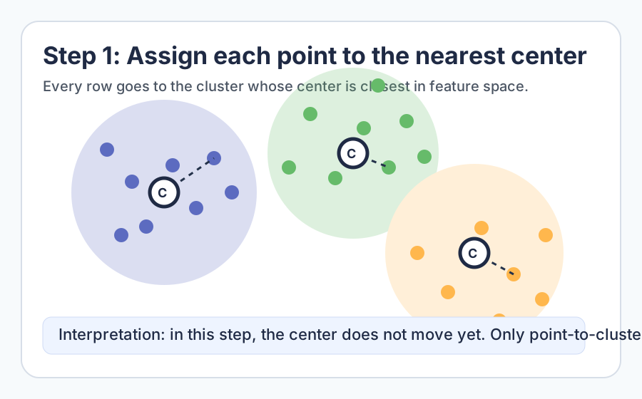
Nearest-center assignment. Look at this before running the code. It shows the first mental model: every point is attached to the closest center.

Centroid update. This is the second mental model: after assignment, each center moves to the mean location of its current cluster.
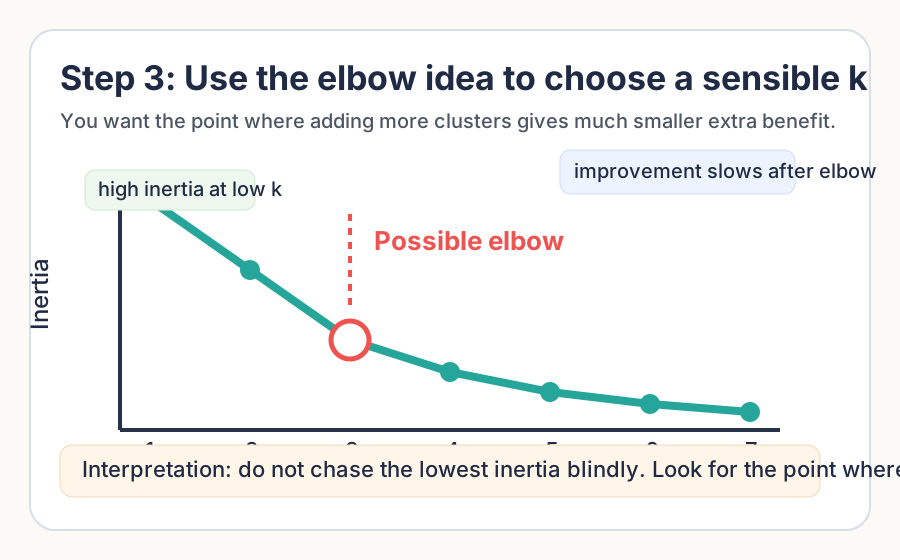
Elbow intuition. Use this as a memory shortcut: choose a practical k where the
improvement starts flattening, not simply where inertia is lowest.